Quick Insights with Excel BI Dashboard (20-Minute Challenge)
- Jul 17, 2025
- 4 min read
Built in Under 20 Minutes Using SQL, CSV, and PDF Data — Leveraging Power Query, Data Modeling, and Pivot Charts to Deliver Executive-Ready Sales Analysis Across Countries and Product Categories
This project presents a dynamic Excel dashboard built using data from SQL, CSV, and PDF sources. It demonstrates the integration of Power Query for data transformation, the Data Model for relationship management, and Pivot Tables and Charts for visualizing key metrics. The dashboard provides insights into global revenue and order trends by product category and country over a six-year period .
Key Skills Demonstrated:
Power Query (Excel): Importing and transforming SQL, CSV, and PDF data
Data Modeling: Building a star schema using Excel Data Model
Pivot Tables & Charts: Constructing insightful and interactive dashboards
Calendar Table Logic: Created a dynamic date table for temporal slicing
Time-Constrained Delivery: Delivered everything in <20 minutes
Tools used:
Excel (Power Query, Data Model, PivotTable, PivotChart)
GitHub repository:

Scenario:
I received a request from the Finance Manager, who had a meeting with the VP in less than an hour. The requirement: a dashboard showing Revenue and Orders by Category, across Countries, covering the period 2016–2021.
Data sources included:
Sales data – from a SQL Server database
Product details – in a CSV file
Store data – in a PDF format
I had just 20 minutes to clean the data, model it, and build a visual dashboard — all using Excel, without Power BI.

Step 1: Understand the Requirement
Before diving into the data, it’s essential to gain a clear understanding of the business requirement.
A quick call with the Finance Manager helped clarify exactly what insights were needed — specifically, Revenue and Orders by Category for each Country over a six-year period (2016–2021).
Additionally, the preferred format of the output was discussed — an Excel-based layout with a dashboard-like appearance was confirmed to be suitable for the upcoming presentation with the company VP.
Step 2: Decide the Workflow
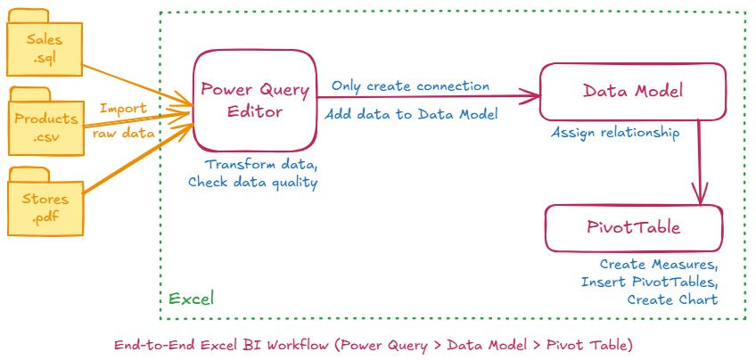
The diagram below illustrates the process I followed to build the dashboard within Excel. It shows how data from different file types was brought into Power Query, transformed, and connected using the Data Model, ultimately enabling fast and flexible analysis through Pivot Tables and Pivot Charts.
Step 3: Import & Transform Data using Power Query
Each dataset was imported differently based on file type:
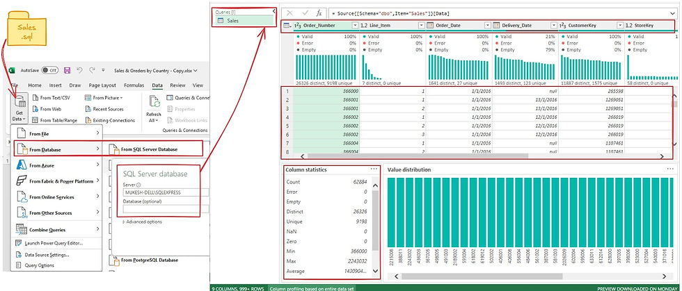
Sales data: Imported using Data > Get Data > From Database > From SQL Server
Products.csv: Imported via Data > Get Data > From File > From Text/CSV
Stores.pdf: Imported using Data > Get Data > From File > From PDF
Each dataset was cleaned in Power Query:
Removed unnecessary columns
Renamed headers
Changed data types
Checked consistency

📌 I chose Power Query over manual lookups (like VLOOKUP or INDEX-MATCH) because:
It automates data cleaning
Easily merges multiple datasets
Works efficiently with structured transformations
📌 I generated a Date Table using Power Query > Blank Query, then used M code to generate dates from 2016 to 2021.
I added:
Year
Quarter
Month Name
Month Number
A separate Calendar Table is essential because:
It enables date filtering without relying on inconsistent date formats
Supports grouping by time periods in Pivot Tables
Step 4: Create Relationships in Data Model
Using Excel > Data > Manage Data Model:
Connected Sales with Products, Stores, and the Calendar using one-to-many relationships
Confirmed correct cardinality and join directions

This relational model enabled seamless data filtering across tables in Pivot Tables.
Step 5: Create Measures, Pivot Tables and Charts
From the main worksheet: Insert > Pivot Table > Select: "Use this workbook’s Data Model"
Measures like Total Revenue and Order Count were created using value fields with aggregation functions (Sum, Count) — no DAX needed.
Total Orders =DISTINCTCOUNT(Sales[Order_Number])Total Revenue = SUMX(Sales,
Sales[Quantity] * RELATED(Products[Unit Price USD])
)Insert Pivot Tables for the following:
Total Revenue by Category and Country
Total Orders by Category and Year
Go to Insert > Pivot Chart to visualize each pivot output
Add Slicers for interactivity:
Country
Year

Used Line and Bar Charts to show trends and comparisons clearly.
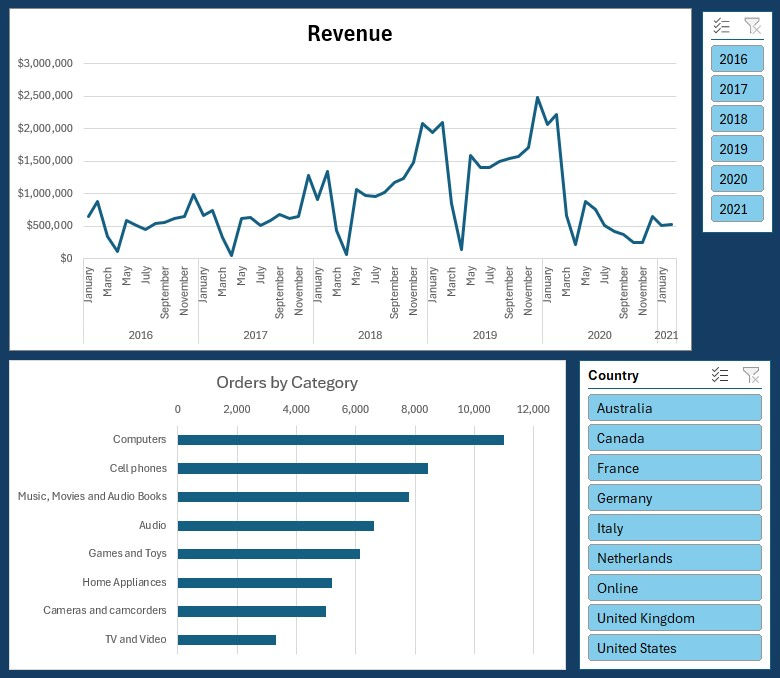
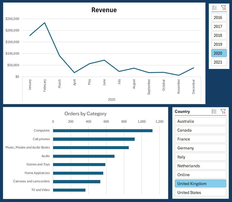
Actionable Insight: Instantly compare revenue and order volumes by country and product category over multiple years. Leverage these insights to make informed decisions on which regions or product categories need renewed marketing focus or operational improvement.
(Note: This example dashboard demonstrates interactive filters for country and year using visualization sliders. Due to screenshot limitations, only partial data is visible in the sample image. Actionable Insights also limited this screenshot as it's provided just as an example.)
Conclusion:
This project was a demonstration of fast-paced, high-impact analysis using Excel’s advanced tools. Despite working with multiple file types and a strict deadline, I was able to deliver a clean, dynamic dashboard with valuable insights.
The final output empowered the Finance Manager to confidently present to the VP, highlighting key performance metrics across product categories and countries.
Lessons Learned
Speed & Simplicity: Delivering insights fast with Excel taught the importance of focusing on essential KPIs for business users rather than overcomplicating dashboards.
Data Foundation: Clean data and a clear model (using Power Query, relationships, and a custom Date Table) are essential—even in simple tools—to ensure reliable analytics.
Interactivity Matters: Slicers for Year and Country made the dashboard more useful, proving that a little interactivity adds big value, even in a rapid project.
Clear Communication: Distilling complex data into straightforward visuals and summaries ensures that insights are accessible and actionable for any audience.
Ready to Scale: The process reinforced that strong fundamentals in data analysis easily transfer to more advanced tools as business needs grow.
Author:
Mukesh Shirke


Comments