PizzaRio Analytics: Building a Scalable Data Pipeline for a Small Retail Business
- Jul 24, 2025
- 8 min read
Updated: May 13
From Raw Excel Files to a Fully Normalized SQL Database and Interactive Power BI Dashboards to manage orders, inventory and staff
This end-to-end project was developed for a fictitious small business (PizzaRio) to help them manage orders, inventory, and staff more effectively. I used Excel for initial data gathering and exploration, and to structure the first version of the tables. This helped identify redundancy and guided the normalization process. I then used SQL for data modeling and query development, and Power BI for building interactive dashboards. The project involved understanding business needs, designing a normalized database, and creating visual reports that provide clear insights into daily operations.
Key Skills Demonstrated:
Data modeling and normalization (3NF)
SQL query writing and view creation
Use of calendar tables for time-based analysis
Power BI dashboard design and DAX measures
Client interaction and requirement gathering
Tools used:
Excel (for early data exploration and transformation)
SQL Server Management Studio (for database and queries)
Power BI (for dashboard/reporting)
GitHub repository:

Scenario:
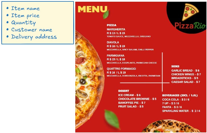
A client operating a small but steadily growing pizza outlet, PizzaRio, approached me with the aim of improving their business operations. The client’s current workflow was entirely manual, and he was struggling to manage various aspects such as tracking inventory, calculating pizza costs, managing staff, and understanding daily order trends. He brought only a basic menu pamphlet and a small sample of daily order information.
He wanted to build a small system that could help him manage these processes more efficiently using a database and a dashboard.

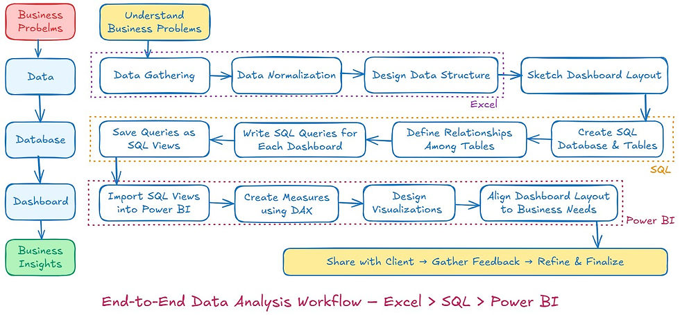
Workflow:
This is the workflow of my analysis process for addressing a real-world business problem. It begins with understanding the client's needs and collecting raw data in Excel, followed by designing a structured SQL database and writing optimized queries. Finally, the data is visualized in Power BI to create interactive dashboards that deliver actionable business insights.
Step 1: Understand Business Needs
The first step was understanding the nature of the business and its daily operations. I had several discussions with the client to learn about his routine challenges and the information he needed to run the business better. This helped me outline the data requirements for three main focus areas: orders, stock control, and staff management.

Step 2: Data Collection and Exploration
Based on the initial input, I expanded the dataset to include:

I started by entering this data into Excel to get a basic feel of how the dataset behaves.

During this process, I identified that:
A single order can contain multiple items, so order_id is not suitable as a primary key.
I introduced a row_id to uniquely identify each row as the primary key.
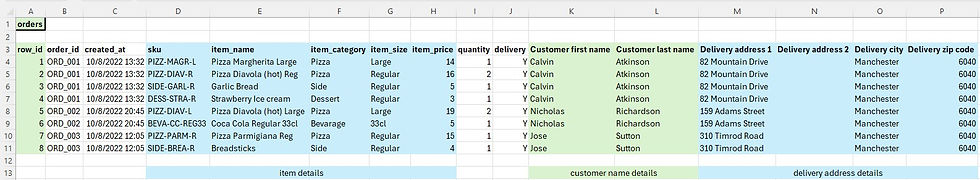
There was significant redundancy in the data, particularly in item details, customer names, and delivery addresses.
Step 3: Data Normalization and Table Design
To reduce redundancy and improve data structure, I normalized the dataset. I created separate tables for different data categories
The main Orders table then referenced these tables using foreign keys. This made the data more efficient, scalable, and ready for SQL database creation.

The following table represents the logical structure of the normalized database. It breaks down the key entities such as items, customers, orders, and staff into separate tables with unique identifiers. This structure ensures minimal redundancy and better scalability.

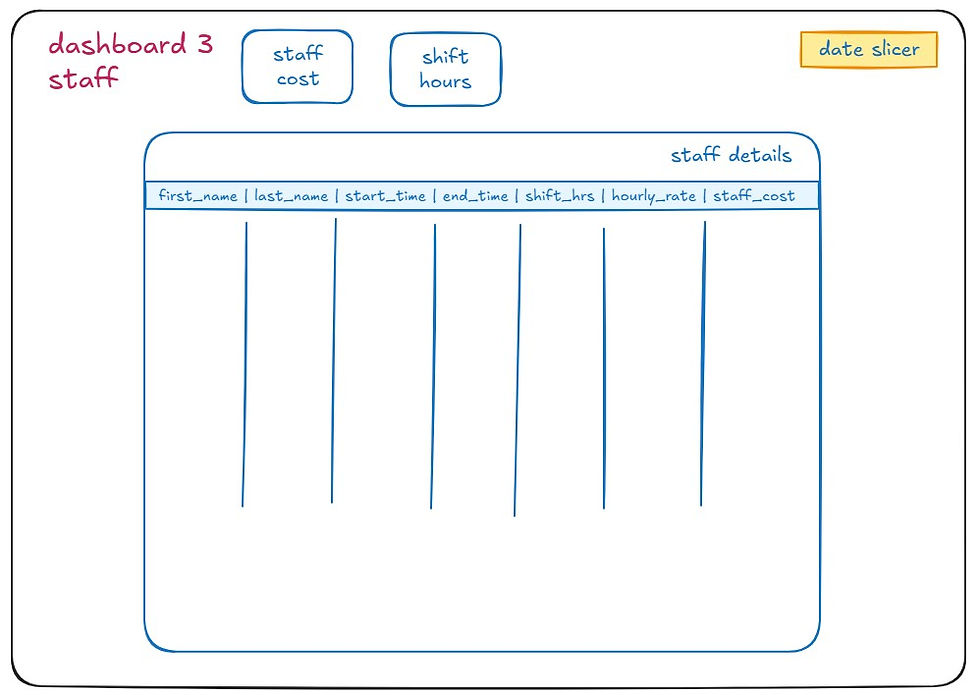
Step 4: Dashboard Design (rough sketch)
Once the data structure was ready, I began sketching the dashboards and discussing them with the client. After reviewing some mockups and making necessary adjustments based on his feedback, we finalized the structure of three dashboards:


Step 5: SQL – Designing and Building the Relational Database
With the dashboard designs approved by the client, the next phase is to build the SQL database. This will include creating all normalized tables and writing queries to generate views required for dashboard reporting.
1. Create Database
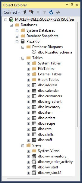
Created SQL database named PizzaRio to store all structured and normalized data. This served as the foundation for building tables, relationships, and running queries for analysis.
2. Create Tables with Appropriate Data Types and Constraints
For each table, I defined suitable data types, set primary keys, and applied constraints such as UNIQUE and NOT NULL where appropriate. This step helped maintain data integrity and prevent duplication or invalid entries.
Followed the same approach to create the other tables.
3. Define Relationships and Assign Foreign Keys
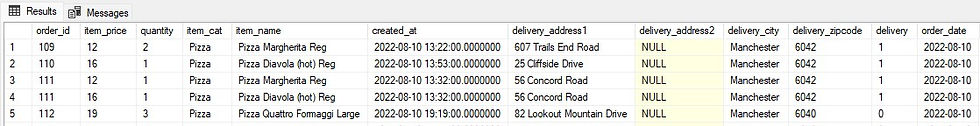
Relationships were created between tables by assigning foreign keys, enabling proper joins and structured data retrieval. For example, the orders table references item, customer, and delivery address tables using foreign keys.
4. Import Data from CSV Files into Tables
I prepared the source data in CSV format and used SQL import functions to load the data into corresponding tables. During import, I ensured data types matched and cleaned any inconsistent entries.
Followed the same approach to import CSV data in the other tables.
5. Establish Date Connections Using a Calendar Table
To ensure consistency across date-related data, I created a separate calendar.csv file containing a continuous range of dates covering the full analysis period. Having a dedicated calendar table is a good practice, as it allows for easier time-based analysis and future expansion (e.g., adding columns for week number, day name, holiday flags, etc.).
The orders table contains a orders.created_at column with both date and time, while the rota table contains a date column with only the date. To link both tables to the calendar, the data types must match. Therefore, I added a new order_date column to the orders table by extracting the date from the created_at field.
The final calendar table includes a cal_date column, which acts as the primary key and is linked to both the order_date in the orders table and the date in the rota table. This setup enables more flexible and consistent time-based reporting across the database.
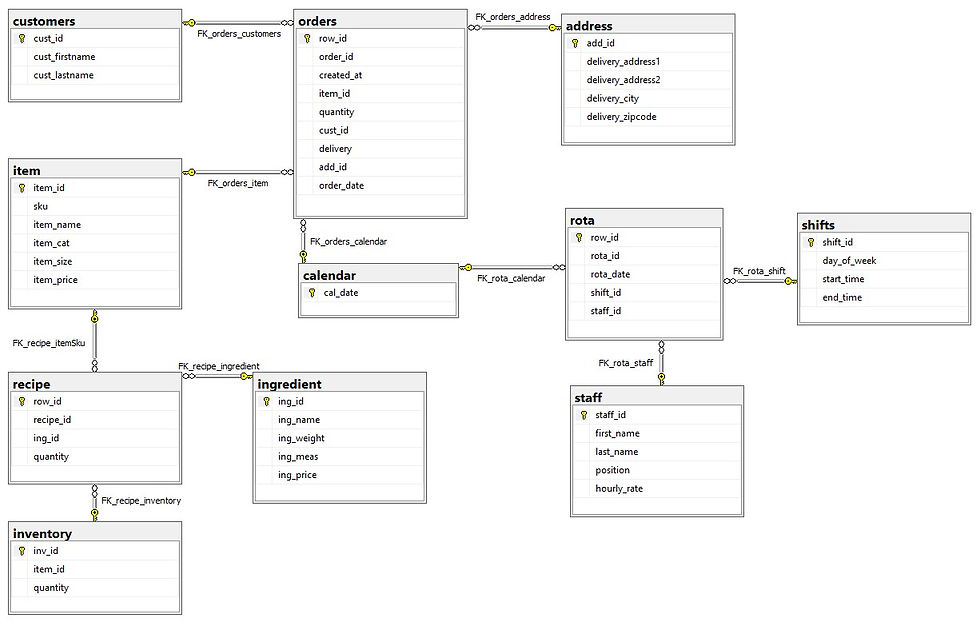
6. Generate and Review Database Diagram
I used the SQL Server Management Studio diagram tool to visualize the database schema. The diagram shows all tables, keys, and relationships, making it easier to validate the design and communicate structure clearly.
Step 6: SQL – Write Queries for Dashboard Metrics and Save as SQL Views
I created SQL queries to extract only the necessary columns required for each dashboard. These queries were designed to streamline calculations and reduce complexity when building visuals in Power BI. Each query was saved as a view in SQL, categorized based on the dashboard it supports—Orders, Inventory, or Staff.
✅ While it's possible to import entire tables into Power BI, I chose to import only views because:
Views return only the relevant data, reducing load time and improving performance in Power BI
It helps keep the data model clean and focused on analysis needs
Sensitive or redundant fields from raw tables are excluded
Logic and transformations are handled in SQL, reducing the need for complex measures in Power BI
Any updates in the SQL view will reflect automatically in Power BI upon refresh
This approach ensures a more efficient, maintainable, and secure data pipeline from SQL to Power BI.
1. Queries for Dashboard 1 - Orders
Created SQL queries to calculate order-level metrics such as total sales, order counts, item quantities, and time-based trends. These views provide clean, aggregated data for Power BI to display insights like top-selling items, hourly trends, and sales by category.
2. Queries for Dashboard 2- Inventory
Built SQL views to calculate ingredient usage, remaining stock, and cost per pizza based on recipe breakdowns. These views support Power BI visuals showing stock levels, low inventory alerts, and pizza production cost analysis.


3. Queries for Dashboard 3- Staff
Developed queries that combine staff schedules and salary data to compute total hours worked and staff cost. These SQL views feed Power BI with summarized staff performance data, enabling labor cost tracking and shift analysis.

Structured Data
All raw data was cleaned, structured, and stored in well-defined tables with proper keys and constraints.
With the data prepared and structured in SQL, the next step was to bring insights to life using Power BI.
Step 7: Power BI – Turning Data into Actionable Business Insights
I imported clean and optimized views from SQL and used them to build interactive dashboards aligned with the client’s business goals. These visualizations helped translate raw data into clear, actionable insights across orders, inventory, and staff performance.
1. Import SQL Views into Power BI
I connected Power BI to the SQL Server and imported only the predefined views. This ensured that only relevant and clean data entered the reporting layer, improving dashboard performance and focus.

2. Create Measures using DAX
In Power BI, I created DAX measures to calculate key metrics such as Total Sales, Average Order Value, Total Items Sold, Staff Cost, and Ingredient Usage. These measures provided flexibility to slice and filter data across time, categories, and customer segments.
✅When working with CSV-imported data, Power BI loads data into its in-memory model, allowing fast performance and full DAX functionality. In contrast, when using DirectQuery with SQL views, the data remains in the SQL Server and queries are sent live. This approach ensures real-time access to updated data but comes with some limitations in DAX functionality and performance. Therefore, I optimized the logic in SQL views to minimize heavy calculations within Power BI and keep reports responsive.
.
Model view

3. Dashboard Design to Answer Business Questions
Dashboard 1 – Orders
Line charts for hourly order trends
Bar charts showing top-selling items
KPI cards for total sales and average order value
Filter for calendar (useful for monthly, weekly, daily analysis)
Helps monitor sales performance, customer preferences, and time-based trends

Actionable Insight : Analyze daily and weekly order trends to identify busy hours and top-selling items. Use these insights to optimize staffing schedules and targeted promotions to boost sales during slow periods.
Dashboard 2 – Inventory
Tables showing ingredient usage per pizza
Alerts for low-stock items
Tracks stock levels and consumption over time
Assists in reorder planning and cost analysis

Actionable Insight : Track real-time inventory consumption and stock levels to prevent stockouts. Proactively plan restocking based on usage patterns, and identify ingredients with abnormal wastage for immediate corrective action.
Dashboard 3 – Staff
KPI cards for total staff cost and labor cost per pizza
Supports labor cost tracking and shift-based performance monitoring

Actionable Insight : Monitor staff allocation versus order volume to improve shift planning. Use attendance and rota data to recognize high-performing staff and address scheduling gaps, ensuring smooth business operations.
(There is scope to add more visualizations in the future, but for a portfolio project, the current set is sufficient.)
Step 8: Share with Client → Gather Feedback → Refine & Finalize
Once the dashboards were completed, I shared the initial version with the client for review. Their feedback was used to make improvements in layout, metric clarity, and visual emphasis. After a few iterations and refinements, the final dashboards aligned well with their expectations and provided a clear view of their business operations. This step ensured the solution was not only functional but also user-friendly and relevant to real business needs.
Conclusion:
The PizzaRio project demonstrates how structured data and interactive dashboards can simplify business decisions. The final solution helps the client monitor key metrics like sales, stock levels, and staff hours. It also reflects my ability to manage full-cycle data projects — from raw input to actionable insights.
Lessons Learned:
Understanding Business Needs is Critical
Early conversations with the client helped shape the structure of the database and the direction of the dashboards, saving time later.
Data Normalization Makes Analysis Easier
Breaking the data into separate tables with proper relationships reduced redundancy and improved query performance.
Planning Dashboard Structure Before Building Saves Time
Sketching dashboards early gave clarity on what data was needed and helped design the right queries and views.
SQL Views Improve Power BI Performance and Maintainability
Using SQL views ensured that only necessary data was imported into Power BI, keeping models clean and fast.
Calendar Tables are Essential for Time-Based Analysis
Creating a central calendar made it easier to link tables with different date formats and enabled consistent time filtering.
DirectQuery Has Trade-Offs
Using DirectQuery with SQL views provides up-to-date data but requires careful planning to manage performance and DAX limitations.
Client Feedback Drives Better Design
Iterative feedback led to more user-friendly dashboards that better addressed real business questions.
Author:
Mukesh Shirke


Comments