From Flat File to 3NF: Normalizing Sales Data for Insightful Analysis
- Jul 18, 2025
- 5 min read
Transforming a Single Raw Dataset into a Structured Relational Model Using Power Query, Excel Data Model, and Tableau
This project demonstrates how I transformed a single, unstructured Excel file containing 31 columns of mixed business data into a fully normalized 3NF data model. Using Power Query and Excel's Data Model, I separated the dataset into dimension and fact tables, built proper relationships, and created a star schema for clean, scalable analysis. The final model was visualized in Tableau, enabling clear insights into product performance, revenue drivers, and underperforming categories.
Key Skills Demonstrated:
Data normalization (1NF, 2NF, 3NF)
Power Query for data transformation
Data modeling and star schema design
Calendar table creation
Tableau dashboard development
Excel Data Model and relationship management
Tools Used
MS Excel (Power Query, Data Model, PivotTable)
Tableau
GitHub repository:

Scenario:
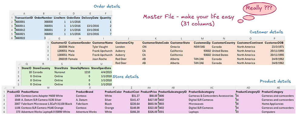
I was handed a large Excel dataset containing 31 columns of detailed information about orders, customers, stores, and products — all bundled into one flat file.
The business requirement was to analyze revenue and product performance at the subcategory level, in order to uncover which product groups were driving the most value and which ones were underperforming. To do this effectively, the dataset needed to be transformed into a structured relational model for accurate and scalable analysis.

Step 1: Understand the Requirement
Before diving into transformation, I discussed the business goal with the stakeholder. The primary objective was to analyze total revenue and units sold across product subcategories, with the aim of:
Identifying top-performing products by revenue and volume
Detecting underperformers
Supporting pricing and promotional strategies
Step 2: Decide the Workflow

Before starting any transformation, I carefully planned how to structure the data to support effective analysis. The original dataset combined information about customers, products, stores, and transactions all in one flat table. To make the data more organized and scalable, I decided to apply data normalization principles—specifically 1NF, 2NF, and 3NF.
This meant splitting the dataset into separate dimension tables (Customers, Products, Stores, Dates) and a central fact table containing transaction-level metrics. Building this as a relational model would not only reduce redundancy but also make the data easier to manage and analyze in the long term. I also planned to use the Diagram View to visually map relationships between tables and validate the structure before moving into dashboard development.
Step 3: Import Raw Data into Power Query
Actions:
Navigated to Data > Get Data > From File > Excel Workbook.
Loaded the file into Power Query using the "Transform Data" option.
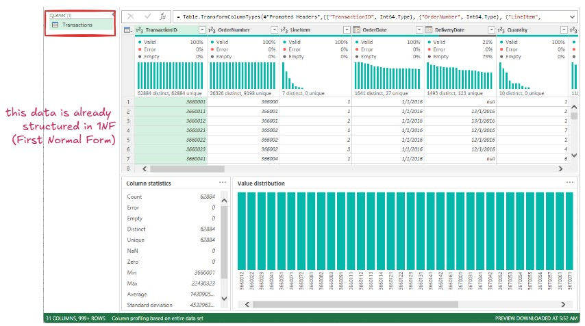
✅1NF – First Normal Form
Goal:
Eliminate repeating groups and ensure atomic values (single value per cell).
Rules:
Each column must contain atomic (indivisible) values.
Each row must be unique.
No multiple values in a single cell.
Step 4: Apply Second Normal Form (2NF)
Objective:
Eliminate partial dependencies and organize data into related dimension and fact tables.
Actions:
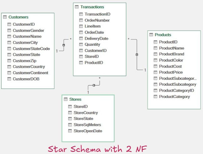
Duplicated the Transactions table into four versions.
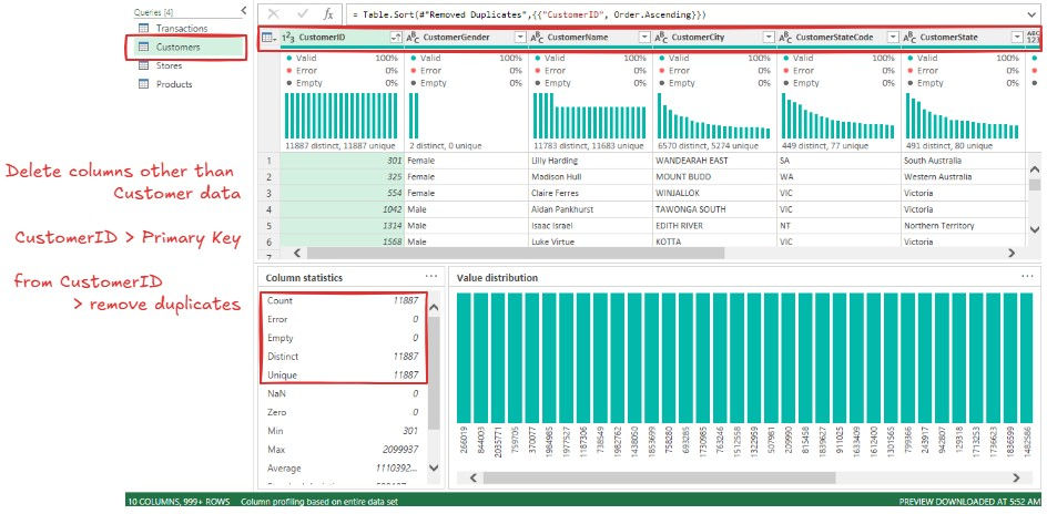
Created separate dimension tables: Customers, Stores, Products.
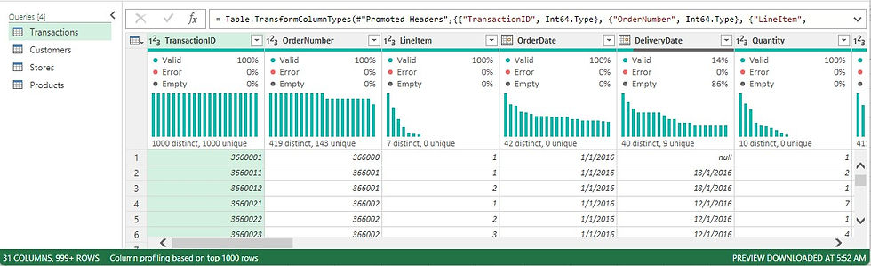
Removed unrelated columns from each dimension table and retained only relevant attributes + primary key.
De-duplicated the primary keys to ensure uniqueness.
Fact Table: Retained transactional columns and included foreign keys pointing to each dimension.

Loaded each table to Data Model with “Only Create Connection” option.
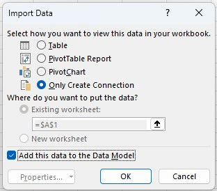
Power Pivot > Manage > Data Model > Diagram View
Handling Partial Dependency
Identified that
OrderDate, DeliveryDate, CustomerID, and StoreID depended on OrderNumber.
ProductID and Quantity depended on both OrderNumber and LineItem.
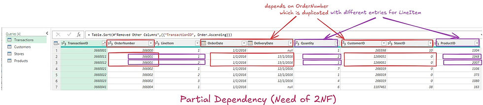
To fix:
Split the Transactions data into:
Order-Level Table
Line Item-Level Table

This way partial dependencies are eliminated and achieved Second Normal Form (2NF)
✅ 2NF – Second Normal Form
🔷 Goal:
Remove partial dependencies — make sure all non-key attributes depend on the entire primary key.
📘 Rules:
Table must be in 1NF.
All non-key columns must be fully dependent on the full primary key, not just part of it.
Step 3: Apply Third Normal Form (3NF)
Objective:
Remove transitive dependencies within the product data.
Actions:
Noted that ProductSubcategory depended on ProductSubcategoryID, and ProductCategory on ProductCategoryID.

Split the Products table into:
Products
Subcategories
Categories
This ensured that each non-key column depends only on the primary key of its respective table.
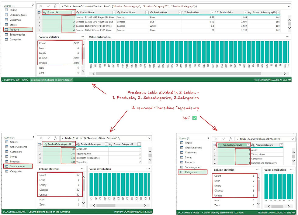
This way transitive dependencies are eliminated and achieved Second Normal Form (2NF)
✅ 3NF – Third Normal Form
Goal:
Remove transitive dependencies — make sure non-key columns depend only on the primary key.
Rules:
Table must be in 2NF.
Non-key attributes must not depend on other non-key attributes.
Step 6: Created a separate Date Table for time-based slicing.

Added custom columns to support advanced visualizations in Power BI / Excel PivotTables.
Step 7 : Build Relational Model (Data Diagram View)
Using Power Pivot:
Linked fact table with dimension tables via primary–foreign key relationships

This model enabled building visuals without data duplication or inconsistency
This step is critical for enabling dynamic filters, slicers, and time intelligence in dashboards.
Step 8 : Tableau Dashboard Development
Once the data model was ready, I moved to Tableau to create a visual representation of the insights.

Actions:
Imported data model into Tableau
Created calculated fields and measures (e.g., Total Revenue, Units Sold)
Built relationships to match Excel model
Dashboard Design:
Bar Charts to compare Revenue vs. Units Sold by Subcategory
Stacked Bars for Category-level analysis
Filters for Region, Customer Segment, and Date Range
Highlight Tables to quickly identify best and worst performers
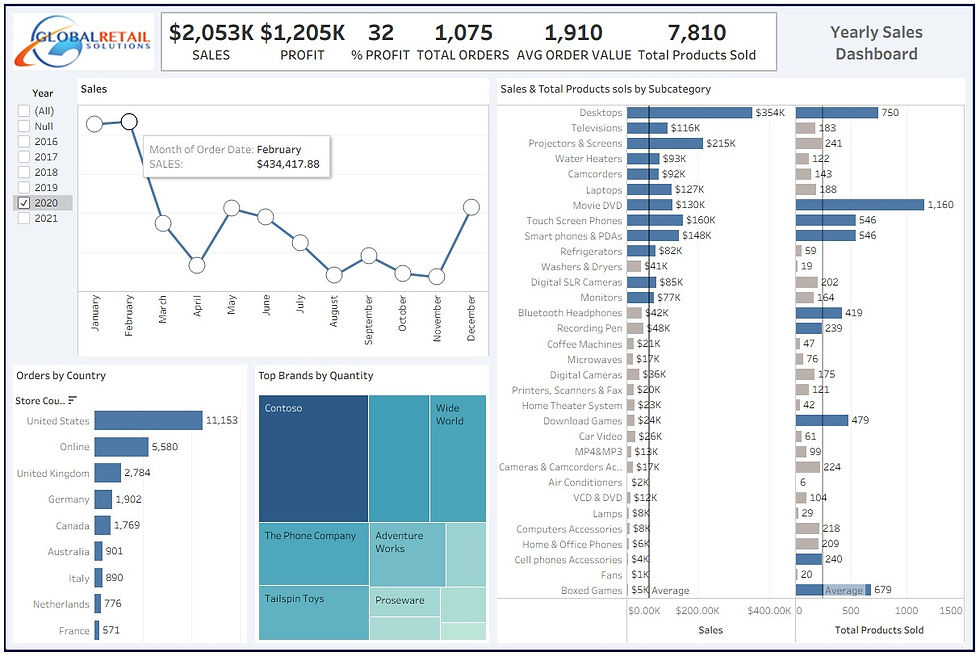
Actionable Insights:
More Products Sold ≠ More Revenue
Movie DVDs had the highest units sold (1,160) but only $130K revenue, highlighting a low average selling price.
Smartphones/PDAs and Laptops balanced both high revenue and strong volume, making them top-performing categories.
Underperforming Categories
Boxed Games, Fans, and Air Conditioners had low sales and low quantity sold, indicating poor overall performance.
High Price, Low Volume
Projectors & Screens and Televisions showed strong revenue despite fewer units, suggesting a premium product positioning.
Need for Promotion or Review
Products like Digital Cameras, Coffee Machines, and VCD & DVD are low in both revenue and quantity—may benefit from marketing efforts or product strategy reassessment.
Conclusion:
This project showcases how raw, unstructured data can be transformed into a clean, relational model using Excel and then visualized effectively in Tableau. By applying normalization and data modeling, I enabled clear insights into product performance, sales trends, and business opportunities. It reflects my ability to turn complex data into actionable, visual stories that support informed decision-making.
Lessons Learnt:
Plan Before You Build: Taking time to plan the data structure upfront made the normalization process smoother and helped avoid rework later in the project.
Normalization is Worth It: Breaking the flat file into a proper relational model reduced redundancy, improved performance, and made the data easier to work with across tools.
Data Modeling Matters: Creating relationships using primary and foreign keys not only improved clarity but enabled powerful, accurate analysis through pivoting and visual tools.
Visualization Brings It Together: Seeing the results in Tableau highlighted how a well-structured backend directly impacts the clarity and usefulness of business insights.
Details Drive Insights: Analyzing both revenue and quantity revealed important product dynamics that wouldn’t be obvious by looking at totals alone.
Author:
Mukesh Shirke


Comments